A Leading Indicator: Why Rental Trends Predict Your Next Capital Gain
For decades, property investors have debated what really drives capital growth. Is it infrastructure? Interest rates? Population growth?
After analyzing 27 years of Australian property data covering over half a million transactions Microburbs has identified a powerful, consistent "early warning" signal that cuts through the noise: Rental Growth.
The data reveals a simple but critical rule: Where rents go, house prices follow.
1. The Core Insight: Rents are the "Canary in the Coal Mine"
House prices are often driven by sentiment, credit availability, and speculation. Rents, however, are driven by raw, immediate human need. They are a real-time measure of supply and demand.
Our analysis shows that rental markets react fast, while sales markets lag behind.
When rents rise: It signals a shortage of housing relative to occupancy demand. Investors eventually notice the improving yields and enter the market, bidding up prices.
When rents fall: It signals an oversupply or fleeing population. Prices often correct downward shortly after as investors exit or struggle to find tenants.
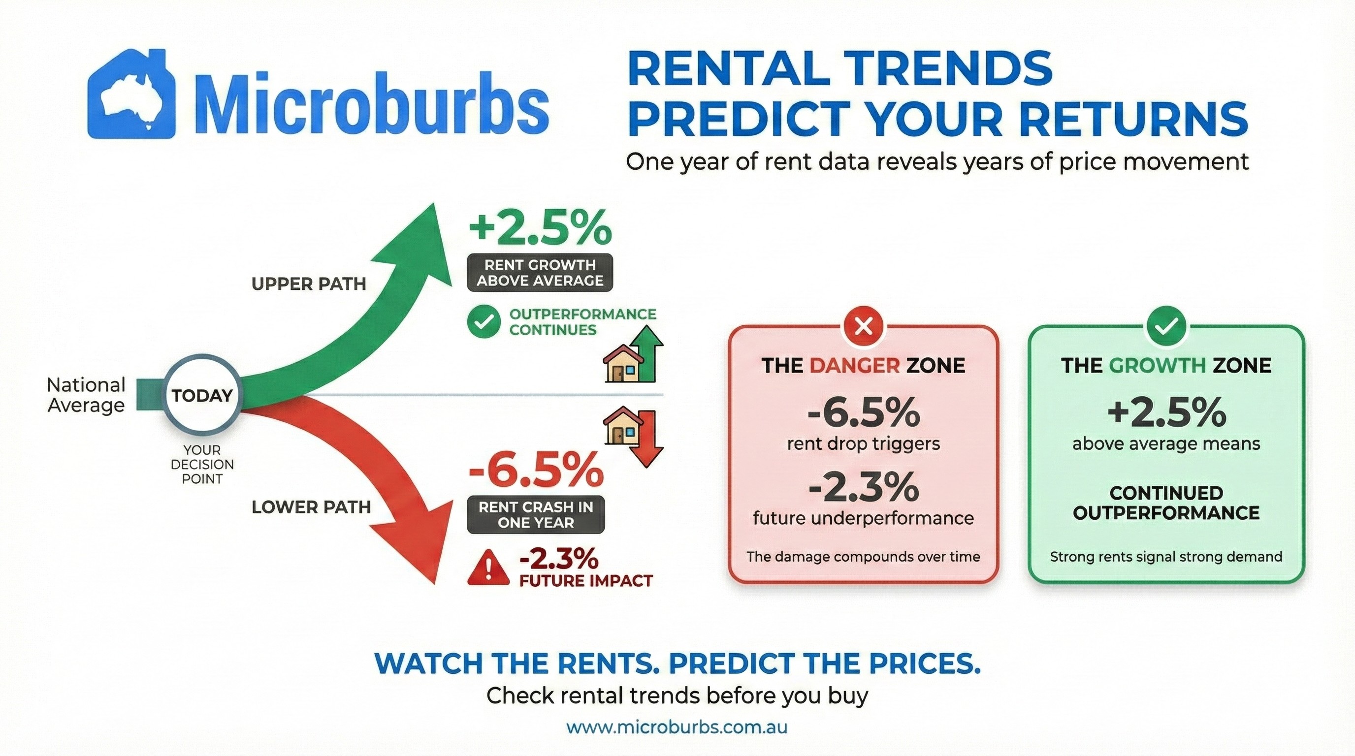
2. The "Danger Zone": Avoid Falling Rents
The most striking finding from our data is the risk of ignoring rental trends. We identified a specific "danger threshold" for investors to watch.
The Red Flag Rule
In suburbs where rents declined by more than 6.48% in a single year, house prices historically dropped by 2.28% per year relative to the national average over the following two years.
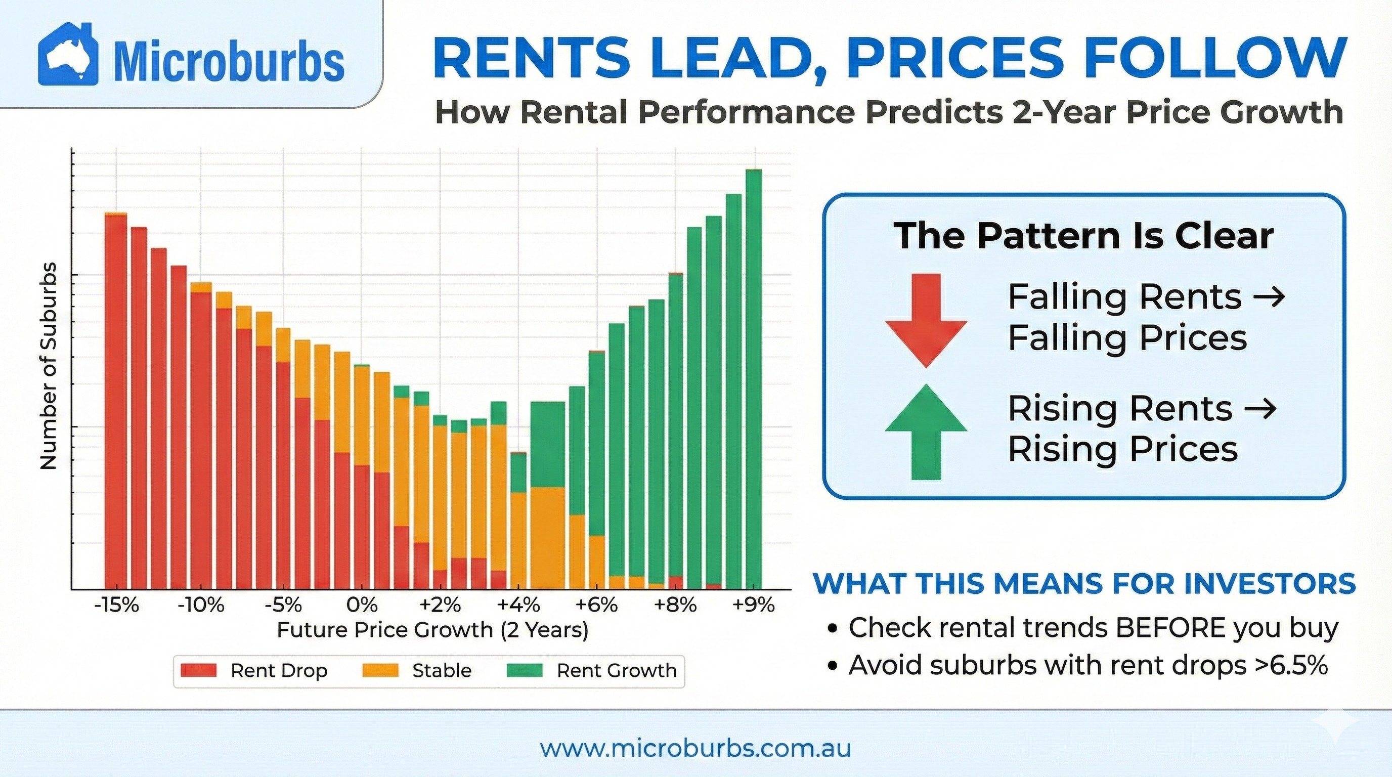
Looking at the data distribution, you can see a clear skew to the left. When rental growth crashes (the Red series), capital growth performance overwhelmingly turns negative.
Investor Takeaway: Never buy into a market solely because it looks "cheap" if rents are actively crashing. That "bargain" is likely a falling knife.
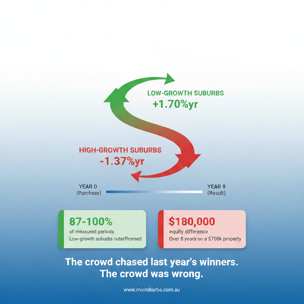
The vast majority of suburbs that fell more than 9% relative to the national average were suburbs where rents had already fallen over 6.48% over the past year.
3. The "Green Zone": Chasing the Yield Compression
Conversely, the data supports the strategy of following rental heat.
The Green Bars (2.45%+ Rental Growth): Suburbs with rental growth exceeding +2.45% over the past year went on to outperform the national average by +1.57% per year over the following two years. These suburbs shift significantly to the right in the distribution, indicating consistent outperformance.
The Mechanism
When rents rise faster than property prices, yields improve. This "yield gap" attracts smart money. As investors flock to capture the higher income, competition drives property prices up, eventually compressing the yield back to normal levels.
This is why rental growth is a leading indicator of capital growth.
4. The Middle Ground: Where Most Suburbs Sit
Suburbs with modest rental movement—between −6.48% and +2.45%—showed essentially neutral performance (+0.13% per year relative to the national average). These are neither red flags nor green lights. They suggest a market in equilibrium, where other factors will determine growth.
For investors, the takeaway is clear: the edges of the rental growth spectrum are where the signal lives. The middle is noise.
5. Supply & Market Tightness: The Vacancy Rate Confirmation
Rental growth doesn't exist in a vacuum. One of the strongest confirming signals is the rental vacancy rate—the percentage of rental properties sitting empty at any given time.
Our research identified clear vacancy thresholds that predict future capital growth:
A vacancy rate below 0.83% is a market under genuine pressure. There simply aren't enough rentals to go around. Tenants compete fiercely, pushing rents higher—which, as we've shown, is the leading indicator of price growth.
When vacancy climbs above 1.86%, the dynamic reverses. Landlords compete for tenants, rents soften, and the capital growth drag is significant at −1.33% per year.
The combination is powerful: When you find a suburb with rental growth above +2.45% AND vacancy below 0.83%, you're looking at a market with both confirmed demand pressure and constrained supply. Historically, these suburbs have been among the strongest performers.
6. How Microburbs Helps You Win
You don't need to crunch 27 years of data yourself. The Microburbs interface is designed to operationalize this insight for you.
- We steer you away from "value traps"—suburbs that look affordable but are suffering from rental oversupply (falling rents).
- We usher you toward high-conviction suburbs where rental demand is currently outstripping supply, positioning you to ride the wave of capital appreciation that typically follows.
Summary: The Investor's Checklist
Before you sign a contract, check the rental pulse:
The Thresholds
Rental Growth (1-year lookback, 2-year forward period)
Rental Vacancy Rate (→ 2-year forward period)
Based on analysis of 27 years of Australian property data covering 500,000+ transactions.