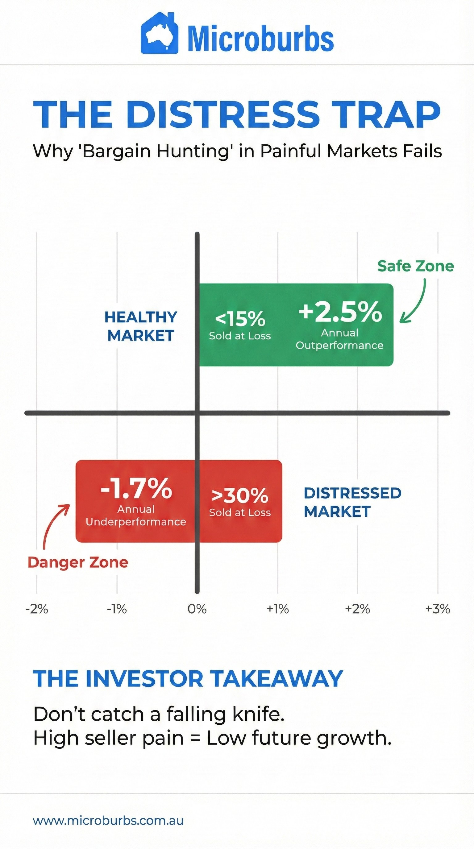
The "Pain Threshold": How Distressed Sales Impact Future Capital Growth
Key Insight: Analysis of national housing data reveals a persistent correlation between the prevalence of loss-making sales in a market and its subsequent capital growth. Historically, markets with higher concentrations of distressed sellers have consistently underperformed the national average.
A Leading Indicator of Market Health
While many investors focus on lagging indicators such as past capital growth, the "distress level"—specifically the percentage of homes selling at a loss—appears to function as a significant leading indicator. The data suggests that the volume of properties selling below their purchase price acts as a drag on future performance.
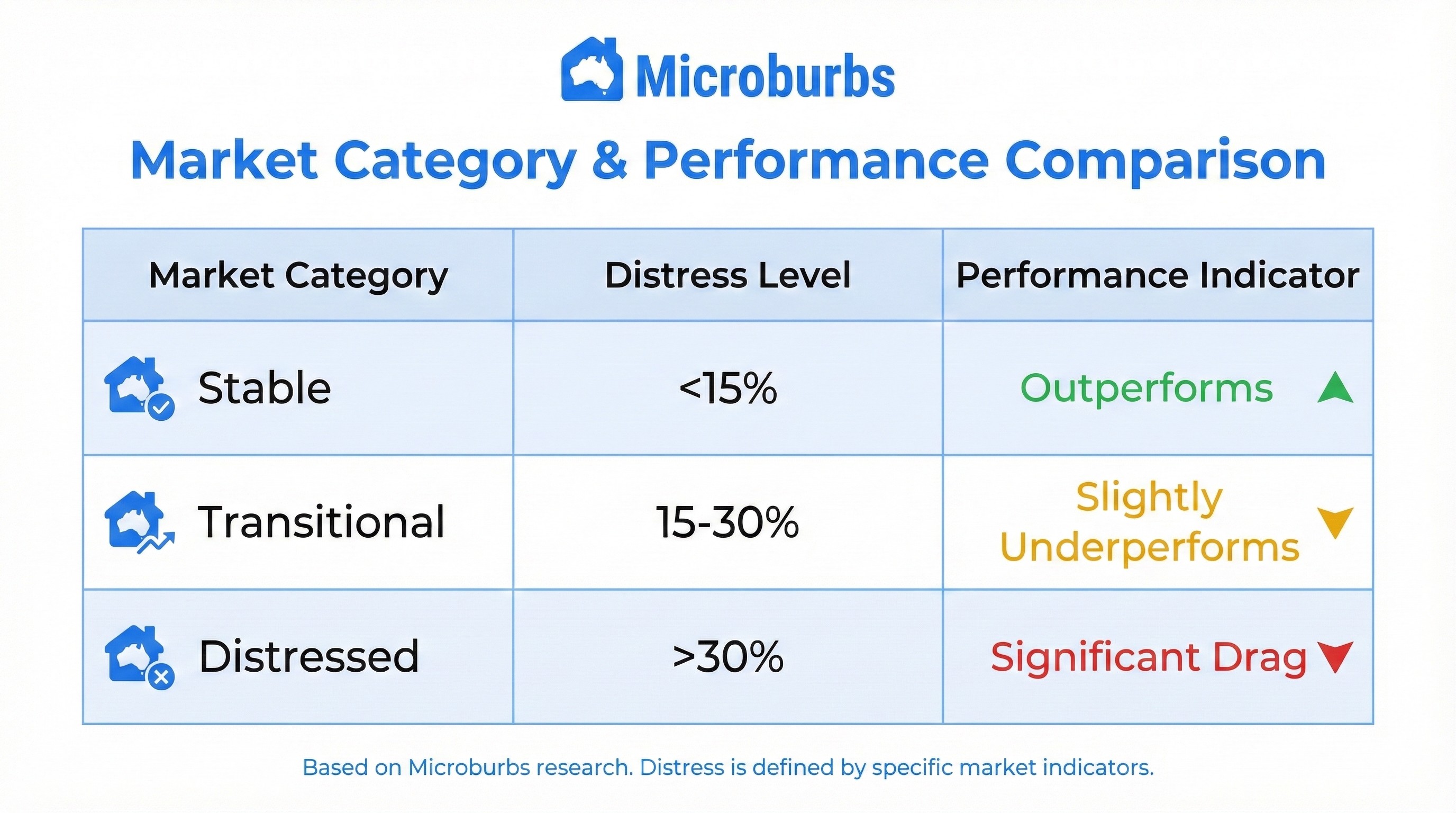
The research categorizes markets into three distinct thresholds based on the proportion of loss-making sales, with precise growth impacts measured over a 2-year forward period:
A Consistent Historical Pattern (2010–2026)
The relationship between high distress rates and low future growth is not a recent phenomenon. The historical data, spanning from 2010 through to projections for 2026, illustrates a stable hierarchy of performance that holds across different market cycles.
Resilience in Stable Markets
The cohort of markets where fewer than 15% of houses sell at a loss has historically maintained a +2.54% positive performance gap relative to the national average. Even during broader market downturns, this group tends to retain its value better than high-distress counterparts.
This is one of the largest effect sizes we've found across all our threshold metrics. Low-distress markets don't just avoid losses—they actively outperform.
The "Distress Drag"
Conversely, markets exceeding the 30% loss threshold display a consistent pattern of −1.67% underperformance per year. In the dataset, the relative capital growth for this group frequently drops below the national baseline, with projections for 2024–2026 showing a particularly sharp divergence.
The Transitional Warning Zone
Markets in the 15%–30% range are already underwater, showing −1.27% underperformance per year. This is an important finding: the damage doesn't start at 30%. It starts at 15%. Once more than one in seven sales in a market is at a loss, the growth drag is measurable and significant.
Statistical Reliability Across Geographies
This pattern appears to be more than a regional anomaly. The dataset covers a vast number of transactions, lending high statistical confidence to the findings.
Large Sample Size: The analysis draws on hundreds of thousands of data points (e.g., over 350,000 observations in the lowest distress bin alone), indicating that this is a broad market mechanic rather than a quirk of small sample sizes.
Significance: Statistical tests (resulting in extremely low p-values) confirm that the difference in growth outcomes between "stable" and "distressed" markets is statistically significant, not random noise. This suggests the trend is applicable across the diverse geographies included in the national average.
Why The Pattern Persists
For the average investor, understanding the mechanics behind this correlation is vital:
Valuation Anchoring
A high volume of distressed sales creates a ceiling on property values. When comparable sales in a neighborhood are recorded at a loss, they influence bank valuations and buyer expectations, making it difficult for prices to rise until the distressed inventory clears.
Supply Dynamics
Markets with loss rates above 30% often signal an oversupply relative to demand. This excess inventory must be absorbed before the market can pivot back to growth.
Confidence Erosion
When one in three sellers in a market is losing money, buyer confidence deteriorates. Potential purchasers demand deeper discounts, creating a negative feedback loop that suppresses prices further.
Summary of Relative Performance
The data highlights distinct performance tiers based on distress levels:
Implication for Investors: While buying in a distressed market may appear to offer "bargain" entry prices, the historical data indicates that these markets often face a longer road to recovery. For those prioritizing near-term capital growth (over a 2-year horizon), markets with low distress levels (<15% sold at a loss) have historically offered a more reliable trajectory.
The Thresholds