# Step 2: Analysing Suburb Pockets
## How to Answer "Where in This Suburb Is Suitable?" With Pocket-Level Data
*This is Part 2 of a 4-part series on the data-driven property research workflow.*
---
## The Hidden Truth About Suburbs
You've completed Step 1 and have a shortlist of 5-10 suburbs that match your investment criteria. Their Growth Forecasts look strong. Their metrics align with your strategy. On paper, they're promising.
Now comes the question that separates successful property investors from the rest: where *within* these suburbs should you actually buy?
Here's the uncomfortable reality that most investors never discover: within any single suburb, there can be a 40%, 50%, even 100% difference in median prices between different streets. Some pockets have grown 80% in 10 years. Others in the same suburb have grown 20%.
The suburb median that everyone quotes in property discussions? It's an average that obscures enormous variation. Relying on suburb-level statistics is like judging a restaurant by the average review of every restaurant on the street. It tells you almost nothing about the specific experience you'll have.
This is where most property investment mistakes happen. An investor finds a suburb with excellent statistics, assumes the whole suburb is equally good, and buys in the wrong pocket. They might purchase in a flood zone because it was cheap. Near public housing because they didn't check. In a pocket that has consistently underperformed because they only looked at the suburb average.
Step 2 exists to prevent these mistakes.
---
## Understanding Pockets: Why 120 Houses Matters
### What Is a Pocket?
A pocket is a grouping of approximately 120 houses that share similar characteristics. Pockets are defined by natural boundaries—major roads, railway lines, parks, changes in topography—and by price and demographic similarities.
The pocket concept acknowledges a fundamental truth about property markets: location value is intensely local. Two houses 500 metres apart can have dramatically different values because one is in a desirable pocket and one isn't.
Traditional property analysis treats suburbs as uniform. Every property in the suburb gets the same suburb median, the same suburb growth rate, the same suburb statistics. This is convenient for data providers but misleading for investors.
Pocket-level analysis recognises that suburbs are collections of distinct micro-markets. Each pocket has its own median price, its own growth trajectory, its own risk profile. Understanding these differences is the key to buying well—or avoiding buying badly.
### Why 120 Houses?
The 120-house grouping is a balance between granularity and statistical validity.
Too small (individual streets) and you don't have enough sales data to calculate meaningful statistics. Medians jump around with each sale, making trend analysis unreliable.
Too large (whole suburbs) and you lose the local variation that actually matters to buyers and renters.
At roughly 120 houses, you typically see enough transactions over a 10-year period to calculate stable growth rates and reliable medians, while still being granular enough to capture genuine local differences.
---
## The Pocket-Level Price Map: Your First Analysis
### Reading the Map
When you open a Suburb Report, the first thing to examine is the pocket-level price map. This is often the "aha moment" for investors new to micro-level analysis.
The map displays the suburb divided into pockets, each coloured according to its median price:
- **Dark blue** indicates more expensive pockets
- **Light blue** indicates cheaper pockets
- **Gradient shades** show the range in between
Hovering over any pocket reveals its specific median price, updated weekly as new sales data arrives.
### What the Variation Reveals
Consider a suburb with a $950,000 median. The pocket-level map might show:
- Several pockets at $1.1-1.2 million (dark blue)
- Most pockets clustered around $900,000-1,000,000 (medium blue)
- A few pockets at $700,000-800,000 (light blue)
If your budget is $800,000, the suburb-level analysis would have suggested you can't afford this suburb. The pocket-level analysis shows you exactly which parts you *can* afford.
This is the first major insight: suburbs you dismissed as "too expensive" might have pockets within your budget. Suburbs you thought were "affordable" might have pockets well beyond your range. The suburb median is a starting point, not the answer.
### Strategic Questions to Ask
When you see a pocket significantly cheaper than surrounding pockets, the critical question is: why?
Sometimes the answer is legitimate:
- The pocket is in a flood zone
- It's adjacent to industrial areas or busy roads
- Public housing is concentrated there
- There's a known nuisance (flight path, train noise, etc.)
In these cases, the discount reflects a real drawback that will persist. Buying there might not be a "bargain"—it might just be appropriately priced for its limitations.
But sometimes the answer is perception that hasn't caught up to reality:
- The pocket had a rough reputation 20 years ago that no longer applies
- Previous poor infrastructure has been upgraded
- Demographic shifts have changed the character but prices haven't adjusted
- It's simply overlooked because it's not on the "desirable" side of the suburb
These are genuine opportunities. You're buying a pocket that will eventually be repriced to match its actual quality.
The pocket-level price map doesn't tell you which scenario applies—but it tells you where to investigate. Any pocket significantly out of line with neighbours deserves explanation.
---
## The Growth Map: Understanding Historical Performance
### Reading Growth Variation
The 10-Year Growth map shows which parts of the suburb have grown more or less than the suburb average over the past decade.
- **Dark blue** indicates above-average growth (outperformers)
- **Light blue** indicates below-average growth (underperformers)
This overlay reveals the internal dynamics of the suburb. Growth is rarely uniform—some pockets attract more demand, some stagnate, some decline.
### The Conventional (But Incomplete) Interpretation
Conventional thinking says: "Buy in the dark blue areas. They're growing faster. That's where the action is."
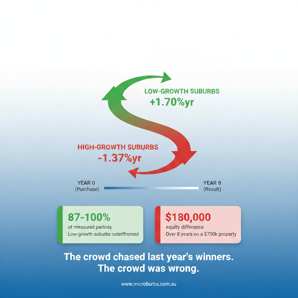
This isn't wrong, but it's incomplete. Past outperformance doesn't guarantee future outperformance. In fact, sometimes it suggests the opposite.
### The Mean Reversion Opportunity
Mean reversion is a well-documented phenomenon in property markets. Areas that significantly underperform their peers for extended periods often experience catch-up growth as:
1. **Buyers get priced out** of expensive pockets and start looking at cheaper alternatives nearby
2. **Gentrification spreads** from desirable pockets into adjacent areas
3. **Infrastructure improvements** remove previous disadvantages
4. **Perception shifts** as new residents move in and change the character
Consider this scenario: Pocket A has grown 80% over 10 years. Pocket B, right next door, has grown only 25%. They share the same schools, same transport links, same shopping precincts. The only difference is Pocket A was always seen as the "good side" and Pocket B wasn't.
What happens next? Pocket A is now very expensive. First-home buyers and investors who would have bought there start looking at Pocket B because they can actually afford it. Demand shifts. Pocket B starts catching up.
This is mean reversion in action. The below-average-growth pocket, right next to high-growth pockets with identical amenities, becomes the opportunity—not the problem.
### When Underperformance Is a Warning
Of course, sometimes a pocket underperforms for good reasons that will continue:
- Persistent flood risk that deters buyers
- Public housing that suppresses growth
- Industrial encroachment worsening over time
- Structural issues (flight paths, rail noise) that can't be fixed
The growth map alone can't distinguish between "underperformer with mean reversion potential" and "underperformer for permanent reasons." That's why risk overlays exist—to help you understand *why* a pocket has performed the way it has.
---
## Risk Overlays: The Non-Negotiable Checks
### The Time-Saving Function of Risk Analysis
Before you fall in love with a cheap pocket showing potential for mean reversion, you must check for risks. This is where investors save months of wasted effort—or lose months if they skip it.
The traditional process looks like this:
1. Find a property that looks good on paper
2. Research it for hours or days
3. Discover it's in a flood zone
4. Start over
The Suburb Report process looks like this:
1. Identify interesting pockets from price and growth maps
2. Overlay risk maps to eliminate problematic areas
3. Only focus on pockets that pass both opportunity and risk criteria
Checking risks upfront—at the pocket level—means you never waste time on properties in areas you wouldn't buy anyway.
### Flood Risk Overlay
Click the flood overlay and you'll see which pockets contain flood-affected properties.
**What you often discover:** The cheapest pocket in a suburb is cheap because half of it is in a flood zone. The low prices that looked like opportunity are actually appropriate pricing for significant risk.
Flood risk matters for multiple reasons:
- **Insurance costs** are significantly higher for flood-prone properties
- **Resale potential** is limited—many buyers won't consider flood-prone areas
- **Physical risk** to the property and your investment
- **Financing** may be harder to obtain
If you're not comfortable with flood risk (and most investors shouldn't be), eliminate these pockets immediately. Don't convince yourself that "this property is high enough" or "it hasn't flooded in 20 years." The risk is priced in by the market for good reason.
### Bushfire Risk Overlay
Particularly relevant in hilly, bushy, or semi-rural suburbs, the bushfire overlay shows where designated bushfire risk areas are located.
**Insurance implications:** Bushfire zones carry significant insurance premium increases—sometimes making properties effectively uninsurable at reasonable rates.
**Practical implications:** Building restrictions may apply. Insurance requirements for construction are stricter. Evacuation plans become a real consideration.
**Investment implications:** Some buyer pools (families with children, retirees) actively avoid bushfire areas, limiting your resale market.
As with flood, if you're not specifically seeking bushfire-zone properties (some investors do, accepting the risks for lower entry prices), eliminate these pockets from consideration.
### Public Housing Overlay
This overlay shows where public housing is located within the suburb.
**Why it matters:** Historical data consistently shows that properties near concentrations of public housing typically experience lower capital growth than equivalent properties further away.
**The nuance of "near":** Proximity matters enormously. A property two streets away from a small public housing cluster might be essentially unaffected. A property immediately adjacent to a large public housing estate will almost certainly see impact.
The overlay shows you:
- Where public housing exists in the suburb
- The concentration (scattered individual units vs. large estates)
- Which pockets are affected and which aren't
**Strategic considerations:** Some investors avoid any public housing exposure. Others view it as a discount opportunity—buying cheaper now and betting on area improvement or public housing redevelopment. Neither approach is inherently right or wrong, but you must make the decision consciously with full information.
### The Elimination Process
Here's the recommended workflow:
1. **Find pockets that fit your budget** from the price map
2. **Overlay flood risk** and eliminate affected pockets
3. **Overlay bushfire risk** and eliminate affected pockets (if applicable to this suburb)
4. **Overlay public housing** and eliminate pockets based on your risk tolerance
5. **What remains is your focus area**
After this process, you've gone from "this suburb looks interesting" to "these specific pockets within this suburb meet my criteria and pass my risk thresholds."
---
## Street-Level Data: The Final Granularity
### Going Deeper Than Pockets
Once you've narrowed to specific pockets, the street-level data table lets you analyse individual streets within those pockets.
This is the final level of granularity before you look at specific properties. Street-level analysis reveals:
- **Street median price:** What properties typically sell for on this specific street
- **10-year growth:** How this street has performed versus the suburb average
- **Rental percentage:** What portion of properties on this street are rented
- **Rental turnover:** How long renters typically stay
- **Sales turnover:** How frequently properties change hands
### Rental Turnover: The Hidden Desirability Metric
Rental turnover is data you won't find on any other platform, and it's a powerful proxy for desirability.
**What it measures:** How long, on average, do renters stay on this street?
**What high rental turnover means (short stays):**
- If renters typically leave after 1-2 years, ask why
- Is it a transient area (students, temporary workers)?
- Are there problems that become apparent only after living there?
- Is the street used as a stepping stone to somewhere better?
**What low rental turnover means (long stays):**
- If renters stay 6, 7, 8 years on average, they *want* to be there
- They're not leaving at the first opportunity
- The street has qualities that make people stay
- This is a strong signal of genuine desirability
**Why this matters for investment:** Long-term tenants mean lower vacancy, lower turnover costs, better property care. Streets where people want to stay are streets where capital growth tends to follow.
### Sales Turnover: Understanding Owner Behaviour
Sales turnover shows how frequently properties on a street change hands.
**Low sales turnover (rare sales):**
- Owners are holding, not selling
- Typically indicates high satisfaction with the street
- May mean opportunity is rare—fewer properties come to market
- Generally a positive signal for long-term investment
**High sales turnover (frequent sales):**
- Could indicate investor activity (buying, renovating, selling)
- Could indicate people wanting to leave
- Could just reflect the type of housing (starter homes that people move out of)
- Requires interpretation based on context
**Strategic use:** If you find a street with low sales turnover and one property comes up, it might be worth acting quickly—the next opportunity could be years away.
### Sorting for Your Strategy
The street-level table can be sorted by any column:
- **Looking for capital growth?** Sort by 10-year growth to find the streets that have outperformed
- **Want owner-occupier neighbours?** Sort by rental percentage ascending
- **Seeking stability indicators?** Sort by sales turnover ascending
- **Targeting long-term tenant demand?** Sort by rental turnover descending
This is where you go from "this pocket looks good" to "these specific streets within this pocket are where I should be looking."
---
## Additional Layers: Schools, Noise, and Lifestyle
### School Catchments
For family buyers (either as owner-occupiers or targeting family tenants), school catchments can significantly impact property values.
**What the overlay shows:**
- Which schools serve which parts of the suburb
- Catchment boundaries for each school
- NAPLAN rankings for each school (top 20%, bottom 20%, etc.)
**The catchment premium:** Two houses on the same street, identical in every way, can have different values if one is in a top-school catchment and one isn't. Families will pay—and pay significantly—for access to quality schools.
**Strategic implications:**
- If you're targeting family buyers/renters, catchment quality matters
- Properties just inside desirable catchment boundaries may command premiums
- Changes to catchment boundaries (which do happen) can affect values
**Important nuance:** The "quality schools" filter in Property Finder looks at proximity to *any* highly-ranked school (public, private, selective). The catchment overlay specifically shows the public school catchment. If public school quality matters to your target buyer/tenant, verify the actual catchment—don't rely on proximity to private schools.
### Noise Maps
The noise overlay shows relative noise levels across the suburb:
- **Major roads** create constant traffic noise
- **Railway lines** affect properties nearby
- **Flight paths** impact suburbs under airport approaches
- **Industrial areas** may generate noise pollution
**Why cheap pockets are sometimes cheap:** That pocket with below-average prices and seemingly strong fundamentals? Check the noise overlay. It might be directly under a flight path or adjacent to a rail yard.
Noise is one of those factors that's invisible in statistics but immediately apparent when you visit. The noise map lets you understand this without driving every street.
**Buyer/renter impact:** Noise-affected properties typically see:
- Lower demand from families (safety and quality of life concerns)
- Lower demand from professionals (work-from-home is affected)
- Reduced tenant pool and potentially lower rents
- Constrained resale market
### Lifestyle Indicators
Beyond hard data, lifestyle indicators capture qualitative aspects of a neighbourhood:
- **Walkability** to cafes, restaurants, shops
- **Access to parks** and recreational facilities
- **Public transport** accessibility
- **Community facilities** (libraries, community centres, etc.)
**Why this matters for investment:** Quantitative metrics (growth rates, yields, vacancy rates) matter, but what ultimately drives property values is desirability. Do people *want* to live there?
Turnover metrics, noise levels, and lifestyle scores are proxies for that qualitative "feel" of a neighbourhood. Two suburbs might have identical statistics, but one has a vibrant cafe strip and walkable streets while the other doesn't. Over 10 years, which one will families pay more to live in?
These indicators help you answer that question without driving every street and visiting every neighbourhood.
---
## The Complete Suburb Report Workflow
### Putting It All Together
For each suburb on your shortlist from Step 1, the Suburb Report workflow is:
**1. Price Map Analysis**
- Identify pockets within your budget range
- Note pockets significantly cheaper or more expensive than neighbours
- Flag price anomalies for investigation
**2. Growth Map Analysis**
- Understand which pockets have outperformed vs. underperformed
- Identify potential mean reversion opportunities
- Note growth patterns (spreading, concentrated, random)
**3. Risk Overlays**
- Eliminate flood-affected pockets (unless flood risk is acceptable to you)
- Eliminate bushfire-affected pockets (where applicable)
- Evaluate public housing proximity based on your risk tolerance
- Document which pockets pass all risk criteria
**4. Street-Level Analysis**
- Within passing pockets, identify specific streets of interest
- Use turnover metrics to assess desirability
- Sort by metrics relevant to your strategy
**5. Additional Layers**
- Check school catchments if targeting families
- Verify noise levels don't explain apparent bargains
- Consider lifestyle indicators for long-term desirability
**6. Document Your Findings**
- Which specific pockets/streets in this suburb work for you?
- What risks have you consciously accepted?
- What questions remain for property-level analysis?
### The Narrowing Process
You started Step 1 with potentially all of Australia.
You ended Step 1 with a shortlist of 5-10 suburbs.
You started Step 2 with those 5-10 suburbs.
You should end Step 2 with specific pockets and streets within 2-4 suburbs.
This is significant narrowing, but it's narrowing based on data rather than guesswork. Every suburb you've eliminated, every pocket you've crossed off—these are decisions backed by analysis, not assumptions.
---
## Common Mistakes to Avoid
### Mistake 1: Ignoring Risk Maps
The excitement of finding a cheap pocket with mean reversion potential can override due diligence. Some investors convince themselves that flood risk "isn't that bad" or that public housing "is being redeveloped."
Maybe those things are true. But more often, cheap pockets are cheap for good reason. The risk maps exist to prevent you from buying someone else's problem.
### Mistake 2: Over-Weighting Historical Growth
Buying the pocket with the best 10-year growth feels safe—proven performance. But you're buying future growth, not past growth. The pocket that's already appreciated 100% might have less runway than the pocket that's appreciated 30% and is due for catch-up.
Use historical growth to understand patterns, not to select pockets.
### Mistake 3: Skipping Street-Level Analysis
The pocket is right, the risks are clear, the price is good—why bother with street-level data?
Because within any pocket, there's still variation. The street with 15% rental and long owner tenure is different from the street with 60% rental and high turnover. Both are in the same pocket, but they'll perform differently over time.
### Mistake 4: Analysis Paralysis
The opposite mistake: spending so long analysing every pocket and street that you never move to looking at actual properties.
Suburb Reports should be thorough but efficient. You're looking for pockets and streets that meet your criteria, not trying to rank every street in the suburb. Once you have 2-4 target areas that pass your filters, move to Step 3.
---
## What You Should Have After Step 2
At the end of the Suburb Report process, you should have:
### Specific Geographic Targets
- 2-4 suburbs from your original shortlist that still look promising
- Within each suburb, specific pockets that fit your budget and pass risk criteria
- Within each pocket, specific streets that show desirable characteristics
### Documented Risk Decisions
- Clear record of which risks you've eliminated (flood, bushfire, public housing)
- Any risks you've consciously accepted and why
- Understanding of why cheaper pockets are cheaper
### Investment Thesis Validation
- Confirmation that your Step 1 hypothesis holds at the micro level
- Or revision of your thesis based on what you've learned
- Clarity on what "good" looks like in these specific areas
### Readiness for Step 3
You're now ready to search for actual properties, with:
- Precise geographic criteria (these specific pockets/streets)
- Clear risk exclusions (automated in Property Finder)
- Understanding of what you're looking for and why
---
## The Key Insight From Step 2
The most important lesson from Suburb Reports is this: **suburb-level analysis is the beginning, not the end.**
Every suburb contains multitudes. Good pockets and bad pockets. High-growth streets and stagnant streets. Flood-prone areas and elevated ground. Premium school catchments and poor ones.
The investor who buys based on suburb averages is playing a lottery. The investor who drills down to pocket and street level is making an informed decision.
Step 2 transforms "this suburb looks promising" into "this specific pocket on these specific streets is where I should focus."
That specificity is your competitive advantage.
---
*Next in this series: [Step 3: Property Finder - Searching for Properties That Meet Your Criteria](/blog-step-3-property-finder.md)*