The Property ‘Goldilocks Zone’: Why the Middle Market Wins on Stability
In property investment, high growth often grabs the headlines. We see news of luxury estates doubling in value during boom years, or budget suburbs suddenly spiking as investors chase yield.
However, when we analyse the data over a full market cycle, a different winner emerges—one that prioritises stability over volatility.
Our latest analysis of median sale prices across all housing sectors identifies what we call the "Goldilocks Zone": the middle band of the property market. While it may not offer the dizzying highs of the luxury sector, it successfully avoids the punishing lows, offering a consistent, risk-adjusted performance that long-term investors value.
The Three Tiers of Market Performance
We analysed median growth relative to the national average over a 14-year period (including projections through 2026). The market splits distinctly into three tiers, each with a unique "personality."
1. The High End ($1.1m+): The "Boom and Bust" Zone
The high-end sector acts as a market amplifier.
The Upside: During the growth phase of 2015–2019, this tier massively outperformed, reaching nearly 6% above the national average annual growth.
The Downside: It is highly sensitive to sentiment and interest rates. In the current projection (2023–2026), this sector is showing the steepest decline, dropping to nearly 5% below the national average.
Verdict: This is a high-beta trade. You can win big, but the drawdowns are severe.
2. The Low End (<$224k): The Counter-Cyclical Zone
The budget market moves inversely to the luxury market.
The Dynamic: When the top end was booming (2016–2018), the bottom end was significantly underperforming. Conversely, as the top end corrects now, the budget sector is seeing a resurgence, projected to rise 3% above the average by 2026.
Verdict: This sector is tactical. It performs best when affordability constraints push buyers down the ladder, but timing the cycle is critical.
3. The Middle Band ($224k – $1.1m): The Goldilocks Zone
What is most striking about this tier is not its height, but its flatness.
The Dynamic: This tier rarely deviates significantly from the mean. It doesn't spike to +6%, but it also doesn't crash to -5%.
The Performance: It hovers consistently just above the 0% baseline (the national average), offering a modest but reliable edge of approximately +0.7% over the long term.
Verdict: This is wealth preservation in action.
Quantifying the Absolute Price Effect
Our threshold research adds a second lens to this analysis: where a suburb sits in the national price ranking and what that means for future growth.
Rather than using fixed dollar values (which shift with inflation), we ranked every suburb by median buy price as a fraction of the national distribution. The results over a 2-year forward period:
What This Tells Us
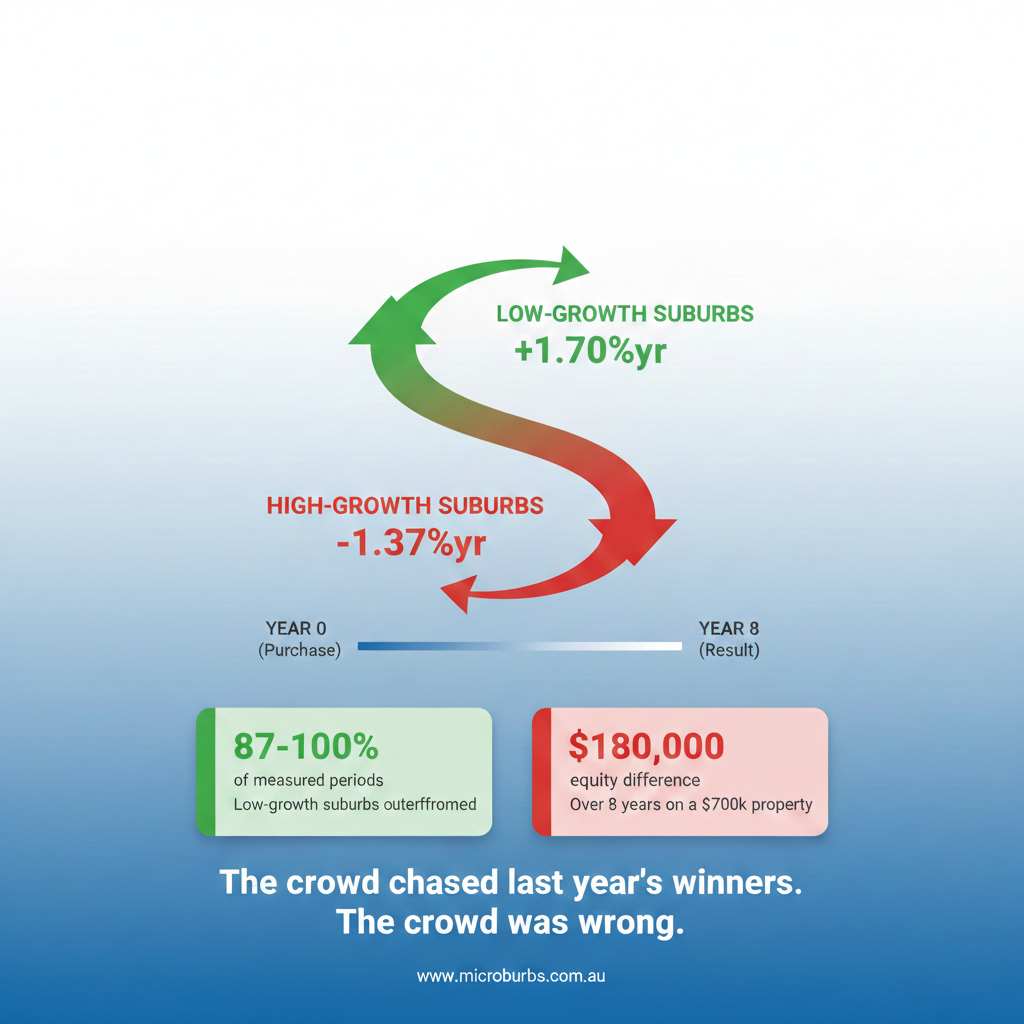
There's a clear gradient: cheaper suburbs outperform more expensive ones on raw capital growth. The very cheapest 4% of the market delivered a striking +2.10%/yr edge.
But this doesn't contradict the Goldilocks thesis—it deepens it. Here's why:
Raw returns vs risk-adjusted returns are different things. The cheapest suburbs deliver higher raw growth but with significantly higher volatility (the "counter-cyclical" pattern we see in the low-end tier). The lower-middle band (4.13%–49%) delivers a modest +0.32%/yr with much less variance—consistent with the Goldilocks Zone's stability advantage.
The expensive half underperforms. Suburbs above the national median price show a −0.87%/yr drag. This confirms that the top end of the market faces structural headwinds: smaller buyer pools, higher interest rate sensitivity, and greater speculative activity.
Performance Summary
Why "Boring" is Good for Investors
The allure of the luxury market is understandable; the gains during a boom are visible and exciting. However, the data highlights the cost of those gains: extreme volatility.
For the average investor, the "Goldilocks Zone" offers the best risk-adjusted stability.
Liquidity
The middle band represents where the majority of owner-occupiers live. There is always demand here, regardless of economic conditions, making these assets easier to rent and sell.
Resilience
When interest rates rise, the luxury market dries up as borrowing capacity shrinks. The middle market, however, captures those buyers stepping down from the luxury tier, supporting prices even in softer economies.
Compounding
While a 0.7% edge sounds small, consistency is the key to compounding. Avoiding the large 5% drawdowns seen in the luxury sector allows the middle market to compound gains uninterrupted over the long term.
The Takeaway
If your goal is speculative capital gains, the edges of the market (Luxury and Budget) offer opportunities—if your timing is perfect.
But for a "set and forget" portfolio designed for long-term hold, the data suggests the lower-middle band is the safest place to be—delivering modest but positive growth without the stomach-churning swings of the extremes.
It's not too hot, not too cold—it's just right.
Based on analysis of median sale prices over 14 years (2010-2026), including projections.