Understanding Microburbs Growth Indicators: Your New Edge in Property Investment
Big news. We've just introduced a new feature to the Microburbs Suburb Finder that changes the game for property investors, homebuyers, and buyers agents: Growth Indicators.
When it comes to property data, having access to the numbers is one thing, but knowing how to turn numbers into meaningful indicators is another. Which metrics actually contribute the most to capital growth? What are the sweet spot ranges within these metrics? At what point should we raise red flags?
Growth Indicators take the guesswork out of this. Our in house data analysts have spent months crunching 1+ billion data points to identify optimal zones for capital growth across nearly every metric in our Suburb Finder.
The Traffic Light System
We've made it simple to spot these opportunities with our colour coded system:
Green: Capital growth most likely
Yellow: Capital growth less likely
Red: Capital growth least likely
As you adjust the sliders in our Suburb Finder, you'll now see these colour indicators showing you which ranges historically correlate with better performance.
How Investors Can Use Growth Indicators
Whether you're a seasoned investor, first time homebuyer, or buyers agent searching on behalf of clients, Growth Indicators give you an evidence based framework for decision making.
Instead of arbitrarily setting your search criteria, you can now align your filters with ranges that have demonstrated stronger growth potential. This means less time second guessing your selections and more confidence that you're fishing in the right pond.
Example 1: Vacancy Rates
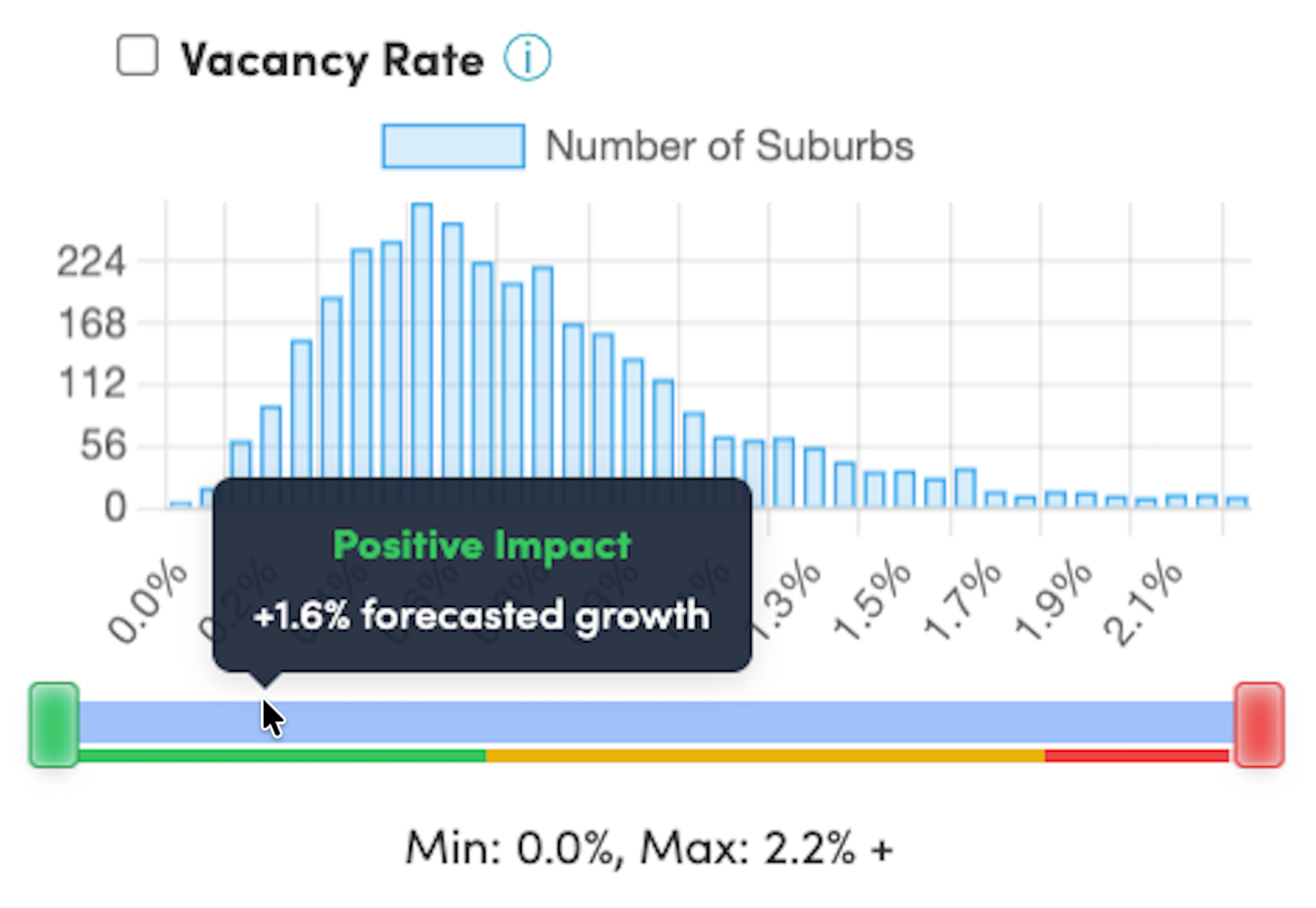
Vacancy rates measure the percentage of rental properties sitting empty, and they're a powerful indicator of rental market health. The Growth Indicators here reveal some striking patterns.
We can see that suburbs with vacancy rates below 0.8% (green) show +1.6% above average growth expectations. This extremely tight rental market indicates strong demand and limited supply, which typically translates into robust capital growth as investors compete for scarce opportunities.
When we look at the middle ground of 0.9% to 1.8% (yellow), we can see this represents a more balanced rental market with neutral impact on future growth. There's enough rental stock to meet demand without creating significant upward or downward pressure on prices.
We can also see that once vacancy rates climb above 1.9% (red), the market tips into oversupply territory, correlating with a -1.3% impact on growth expectations. More properties sitting vacant for longer typically means landlords face weaker rental demand and may need to reduce rents to attract tenants, which dampens investor confidence and capital growth prospects.
Example 2: The 10 Year Growth

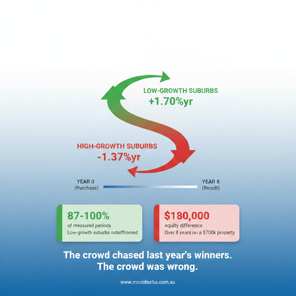
Here's where it gets interesting. You might assume that suburbs with the highest historical growth are your best bet for future returns. Our data tells a different story.
For 10 year growth, we've found that suburbs with below 5 percent growth over the past decade (green) are actually positioned for the strongest future performance, our analysis forecasts +2.6% above average growth for suburbs in this range.
Meanwhile, anything above 5 percent past growth falls into the red zone, with a forecast -2.1% impact on future growth.
Why? Two key concepts: mean reversion and relative pricing.
Mean reversion is the tendency for prices that have moved significantly in one direction to eventually drift back towards the average. Suburbs that have already experienced strong growth have often become relatively expensive compared to their fundamentals. Their prices have run ahead, and the market needs time to catch up, or in some cases, those prices need to cool off.
On the flip side, suburbs in our green zone may have underperformed recently, but that often means they're now relatively affordable and primed for their moment. They represent better value, and the market has room to recognise that value through future growth.
Making Better Decisions
The beauty of Growth Indicators is that they work together. You're not just looking at one metric in isolation, you're building a complete picture of a suburb's growth potential across multiple dimensions.
A suburb might tick the box on one metric but fall into the red zone in another. Growth Indicators help you weigh these factors and understand the trade offs you're making with each search criteria adjustment.
The Bottom Line
Property investment doesn't have to be a shot in the dark. With Growth Indicators, you're leveraging patterns identified across billions of data points to guide your suburb selection. It won’t predict the future, but it does tilt the odds in your favour using real patterns in the data.
Jump into the Suburb Finder, play with the sliders, and watch the colours guide you towards your next opportunity. Keep an eye out as we roll out Growth Indicators to even more metrics in the coming months.