We've all been there. Staring at 40+ property metrics, trying to figure out which ones actually matter. Is 25% renters too high? What about 18% growth over 10 years—good or bad? Should I worry about that vacancy rate?
The truth is, most investors are either paralysed by data overload or relying on arbitrary rules of thumb that may be costing them money.
Today, we're changing that with Thresholds—a feature that distils 15 years of property market research into clear, actionable guidance you can use in seconds.
The Problem We Solved
Here's what we kept hearing from investors and buyer's agents:
"How do I know if this metric is actually good or bad?"
"I'm looking at the same suburbs as everyone else because I don't know which metrics to prioritise."
"I've been told never to buy above 20% renters, but I feel like I'm missing opportunities."
These aren't bad questions—they're the right questions. But until now, answering them required either years of experience or expensive consultations with industry experts.
We asked ourselves: what if we could take everything we've learned from analysing every suburb and street in Australia over the past 15 years and turn it into a system anyone could use?
What Thresholds Actually Does
Thresholds uses a simple traffic light system to show you instantly whether a metric indicates:
- Green: Favourable conditions for capital growth
- Yellow: Neutral—acceptable but not ideal
- Red: Warning signs that may detract from growth
But here's what makes Thresholds different from generic "rules of thumb": every threshold is validated against 15 years of actual property performance data across Australia.
We didn't guess. We didn't rely on industry folklore. We tested.
The Numbers Behind the Thresholds
Every threshold we publish comes with a specific, quantified impact on capital growth relative to the national average. Here's a preview of the key findings across our research:
These deltas represent the average annual outperformance or underperformance relative to the national average over a 2–8 year forward period, depending on the metric.
Notice the scale. A +2.54% annual edge from buying in low-distress markets doesn't sound dramatic—until you compound it over a decade. On a $700,000 property, that's roughly $200,000 more in equity versus buying in a distressed market.
That's what the right thresholds can do for you.
Why This Changes Everything
Before Thresholds, using Microburbs meant being handed 50,000+ potential data points and figuring out what they meant for yourself. That's powerful if you have the time and expertise. But most investors don't.
Now, instead of asking "what does this number mean?", you can ask "is this number good for capital growth?" and get a validated answer instantly.
For Buyer's Agents
Stop recommending the same suburbs as every other BA. When you understand street-level thresholds for renter concentration, you can find the desirable pockets within suburbs others have written off. While your competitors are fighting over the same 50 "safe" suburbs, you're finding opportunities in places they'd never look.
For DIY Investors
No more second-guessing your analysis. See a suburb you like? Thresholds tells you immediately which metrics support your thesis and which ones are red flags. Make decisions with the same confidence as professionals who've been doing this for decades.
For Everyone
Science beats vibes. Every threshold we display is backed by data, not opinion. We'll show you exactly how we calculated it, what the confidence levels are, and what the expected impact on growth looks like.
A Surprising Finding: Demographics Matter
One threshold that often surprises investors is the role of cultural diversity in predicting growth.
Our analysis found that suburbs where 7.6% to 27.2% of residents have overseas-born parents outperformed the national average by +1.48% per year. Below that range, suburbs slightly underperformed (−0.36%), and above 27.2%, the effect reversed sharply (−1.52%).
Why? Moderate multicultural populations often signal strong demand fundamentals—established migrant communities attract further settlement, supporting housing demand without the oversupply pressures that can emerge in very high-concentration areas. It's a proxy for sustained, organic demand.
This is exactly the kind of insight that rules of thumb miss entirely.
What's Coming Next
Thresholds is rolling out across all our products:
- Suburb Finder: Filter by threshold ranges to find suburbs that meet your criteria
- Suburb Reports: See at a glance which metrics are working for or against a suburb's growth potential
- Property Finder: Identify specific properties that sit in the green zone across multiple thresholds
- Property Reports: Understand exactly what's driving (or dragging) a property's expected performance
We're also building educational content—whitepapers, videos, and detailed explainers—so you can understand not just what the thresholds are, but why they matter.
The Bottom Line
For 15 years, we've been asking the question: what actually drives property prices up?
We've tested every theory. Challenged every assumption. Analysed every suburb and street in Australia.
Thresholds is the answer, packaged in a way anyone can use.
No more guessing. No more arbitrary rules. Just data-driven decisions that put the odds in your favour.
Explore the Research
Dive deeper into the studies behind Thresholds:
- Why We Don't Use CoreLogic: How Microburbs Gets Better Data — How we built a database of 90M+ listings and why it matters
- Rental Growth Predicts House Price Growth — The leading indicator most investors miss
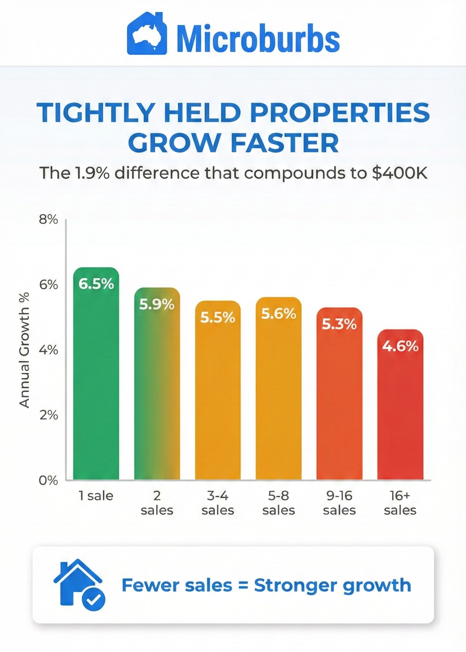
- Tightly Held Houses Grow Faster — Why turnover rate matters more than you think
- Pocket-Level Mean Reversion — Why chasing 'hot pockets' could cost you
- Market Distress: The Pain Threshold — How distressed sales predict future growth
- The Property Goldilocks Zone — Why the middle market wins on stability
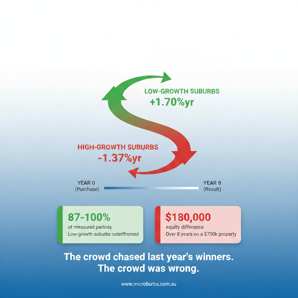
- Why You Should NOT Buy High-Growth Suburbs — The counterintuitive case for underperformers